
Bloom & Branch
This project explores how packaging design can be used to strategically communicate different levels of product value. For the fictional skincare company "Bloom & Branch," I was tasked with creating two distinct label designs for the same hand cream product: one to position it as a "budget" item, and the other as a "premium" offering.
The Challenge
The core challenge was to use only the label's design—its shape, typography, and layout—to influence consumer perception and justify two different price points for the same core product.
The primary goals were to:
Develop two unique label designs under a single brand, "Bloom & Branch."
Create a "budget" version that communicated value and accessibility.
Create a "premium" version that communicated luxury and quality.
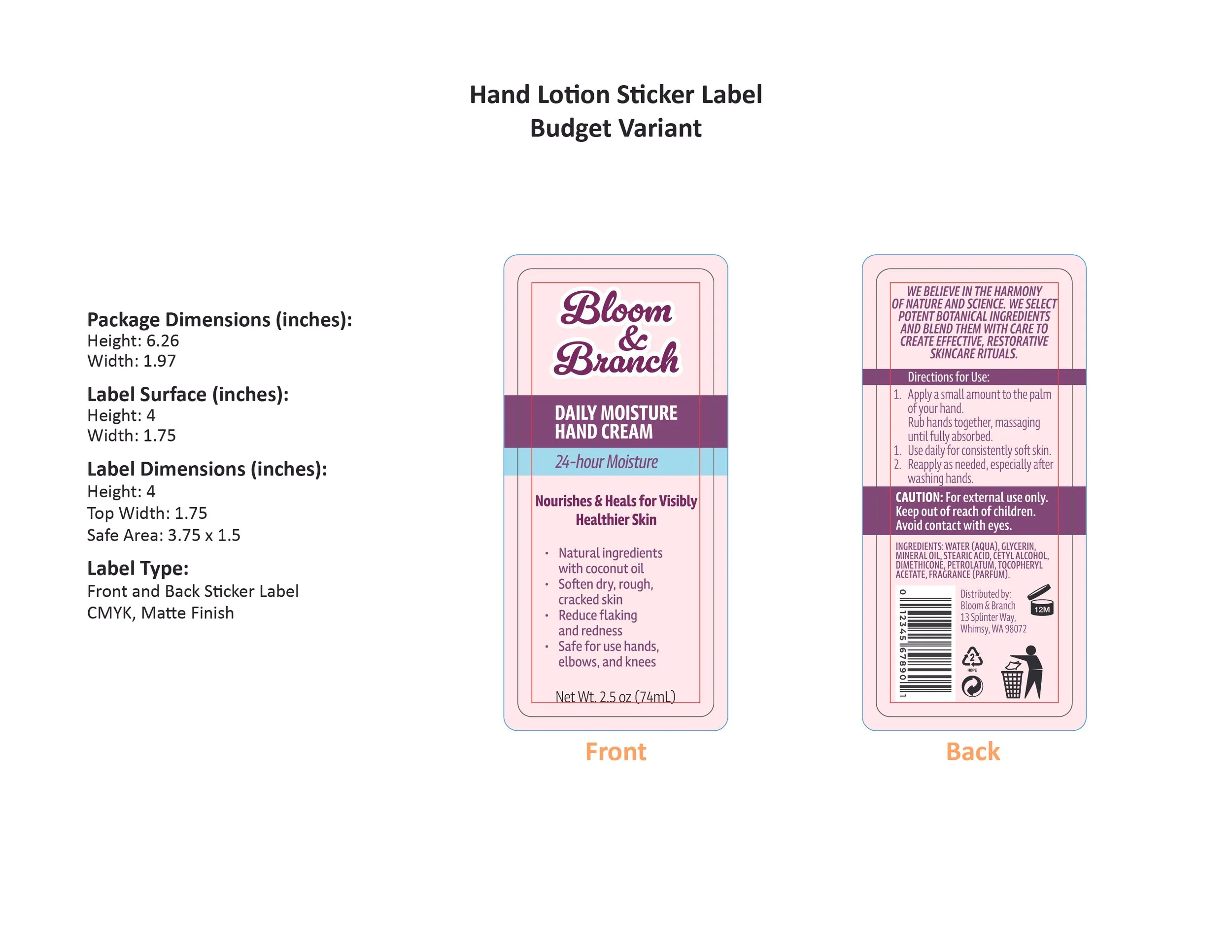
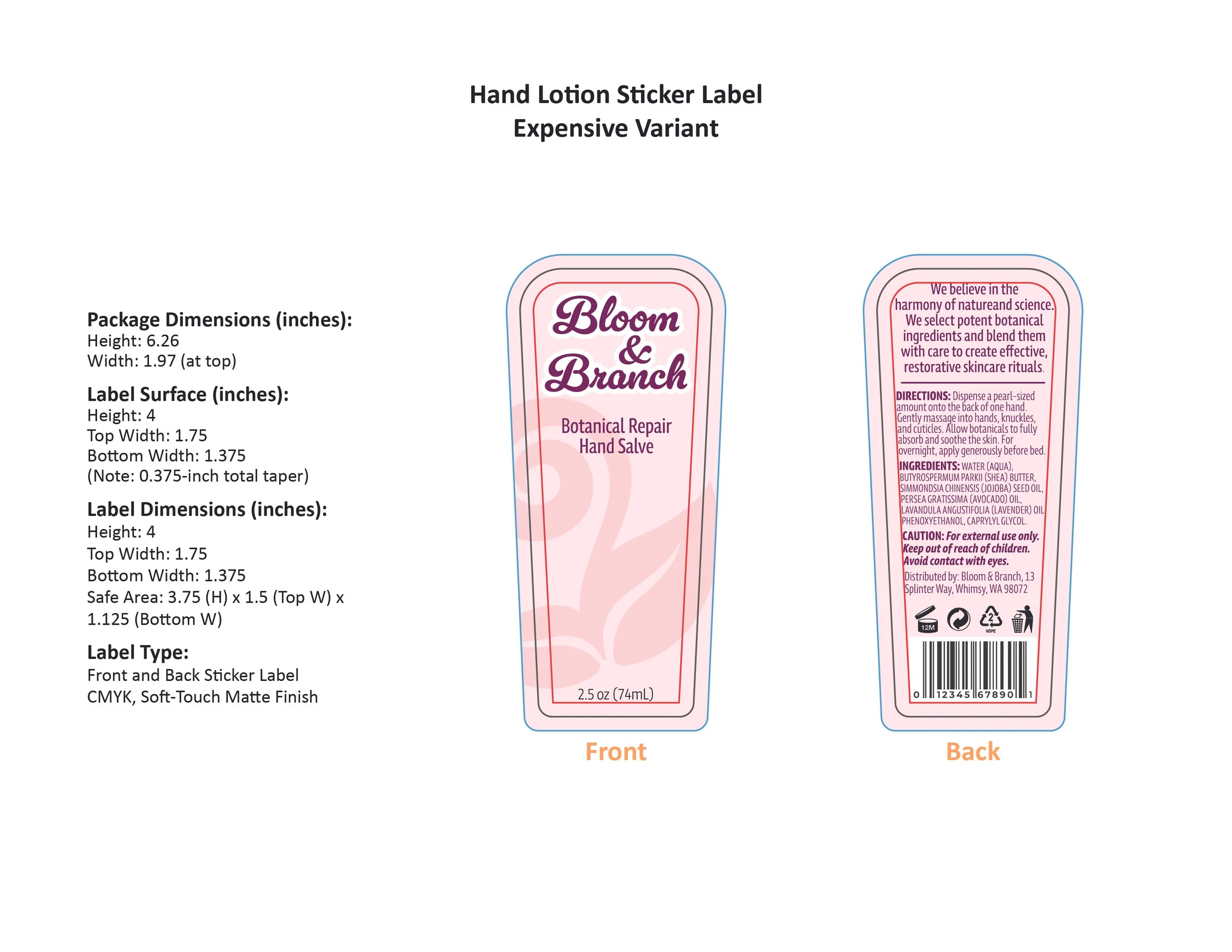
Design custom dielines from scratch based on real-world product measurements.
The Process
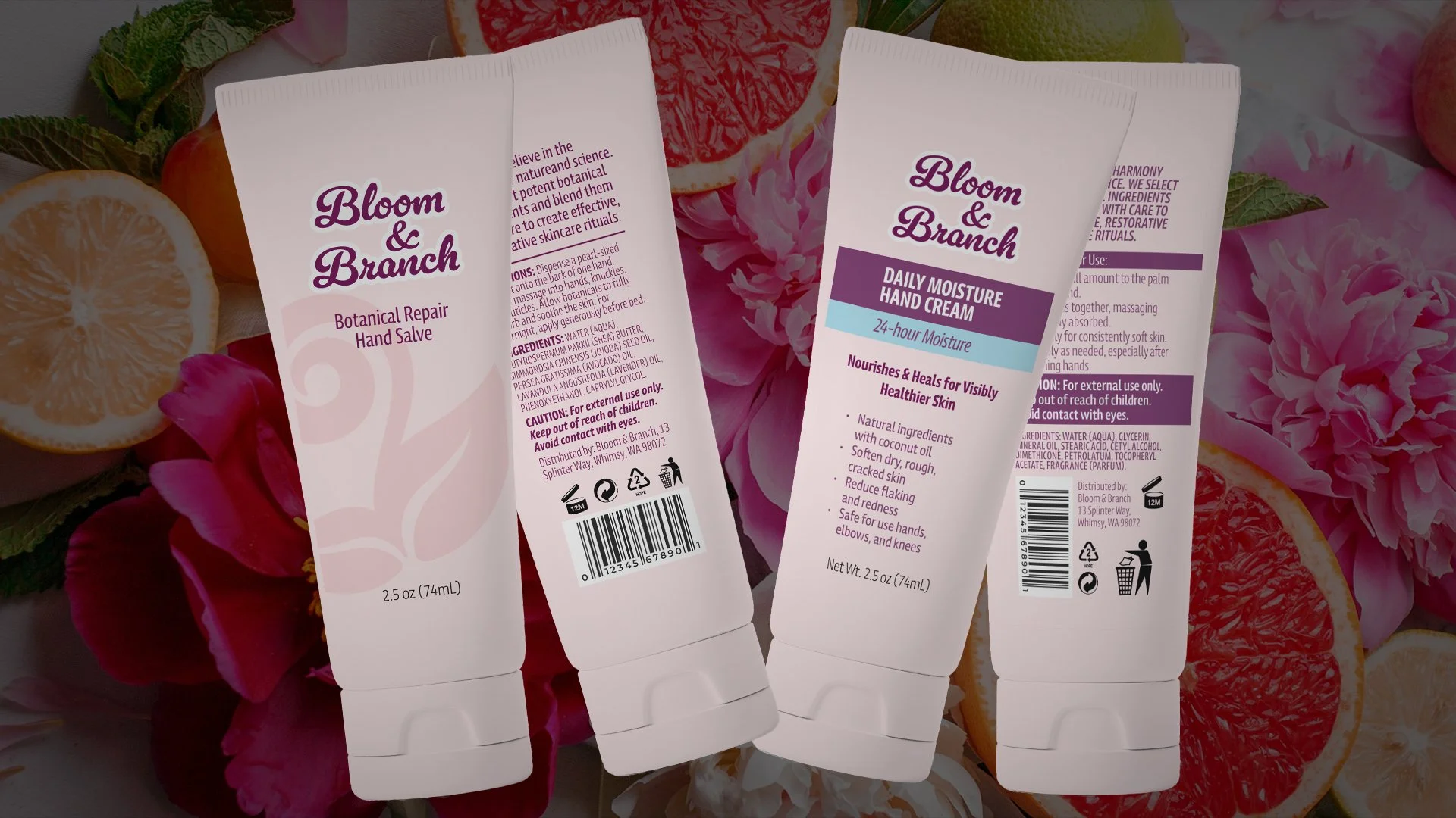
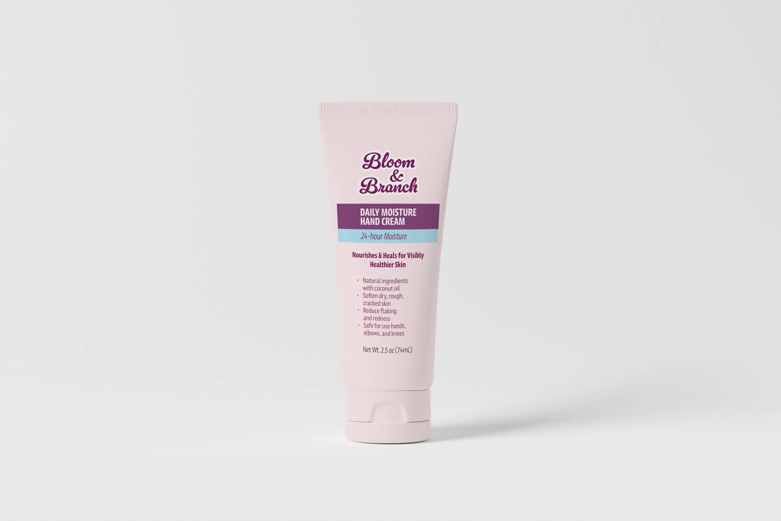
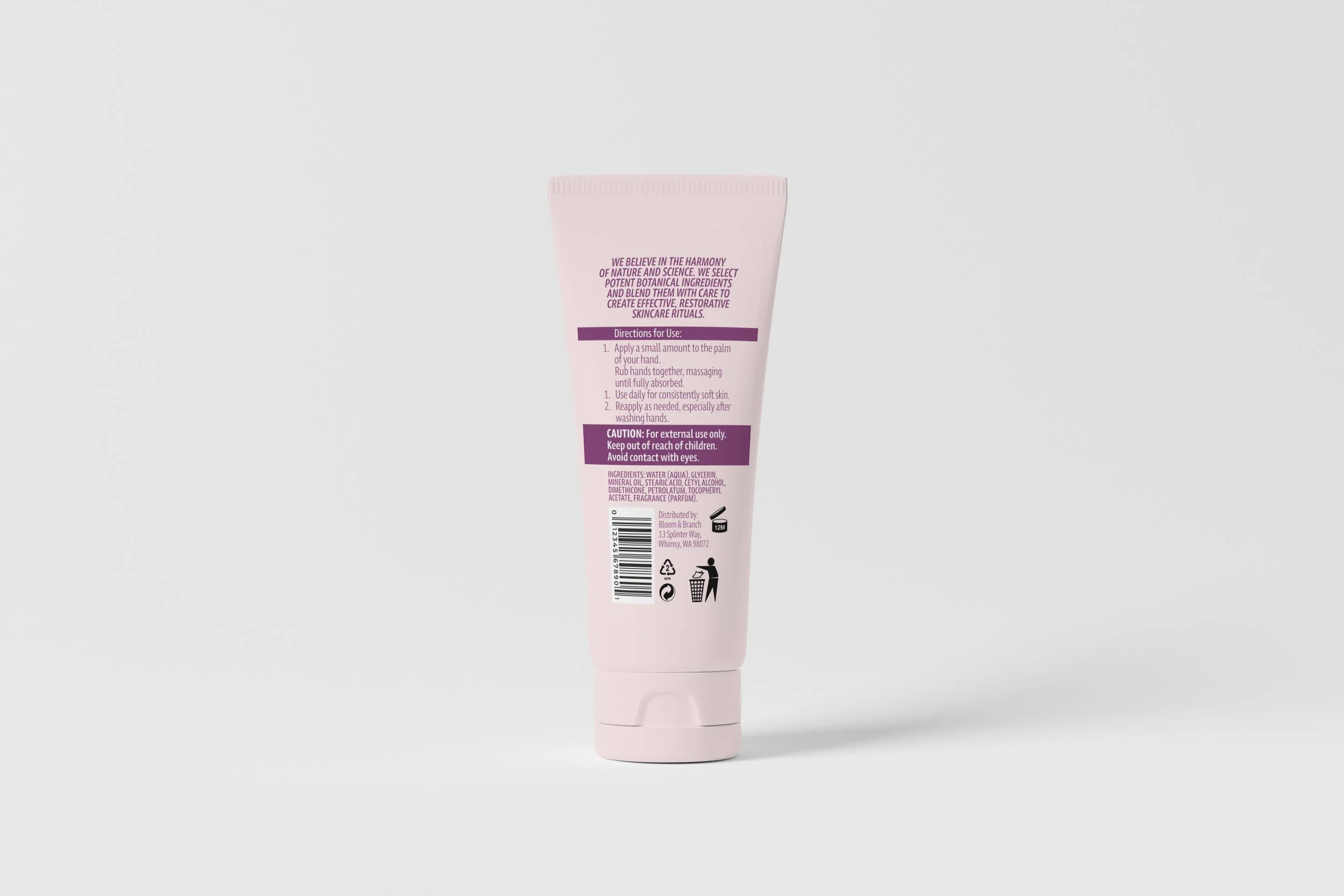
The design process was driven by strategy. For the budget-friendly "Daily Moisture Hand Cream," I used a standard rectangular label and a content-rich layout. This approach feels familiar and straightforward, signaling practicality and value to the consumer.
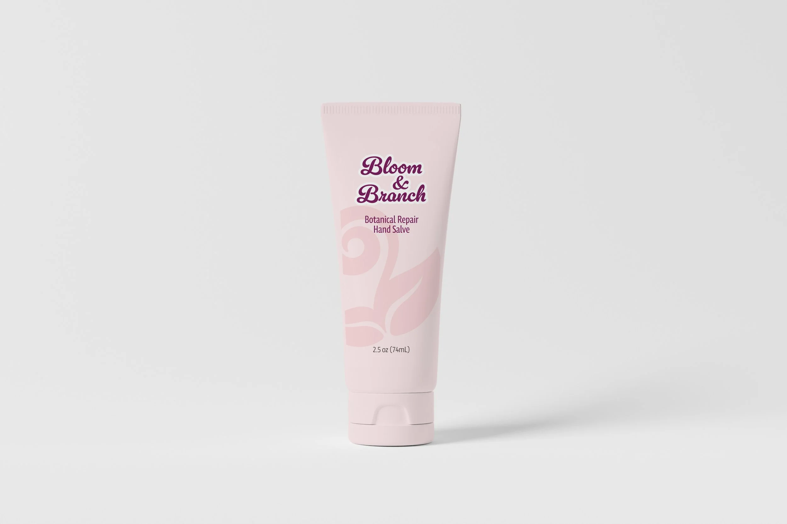
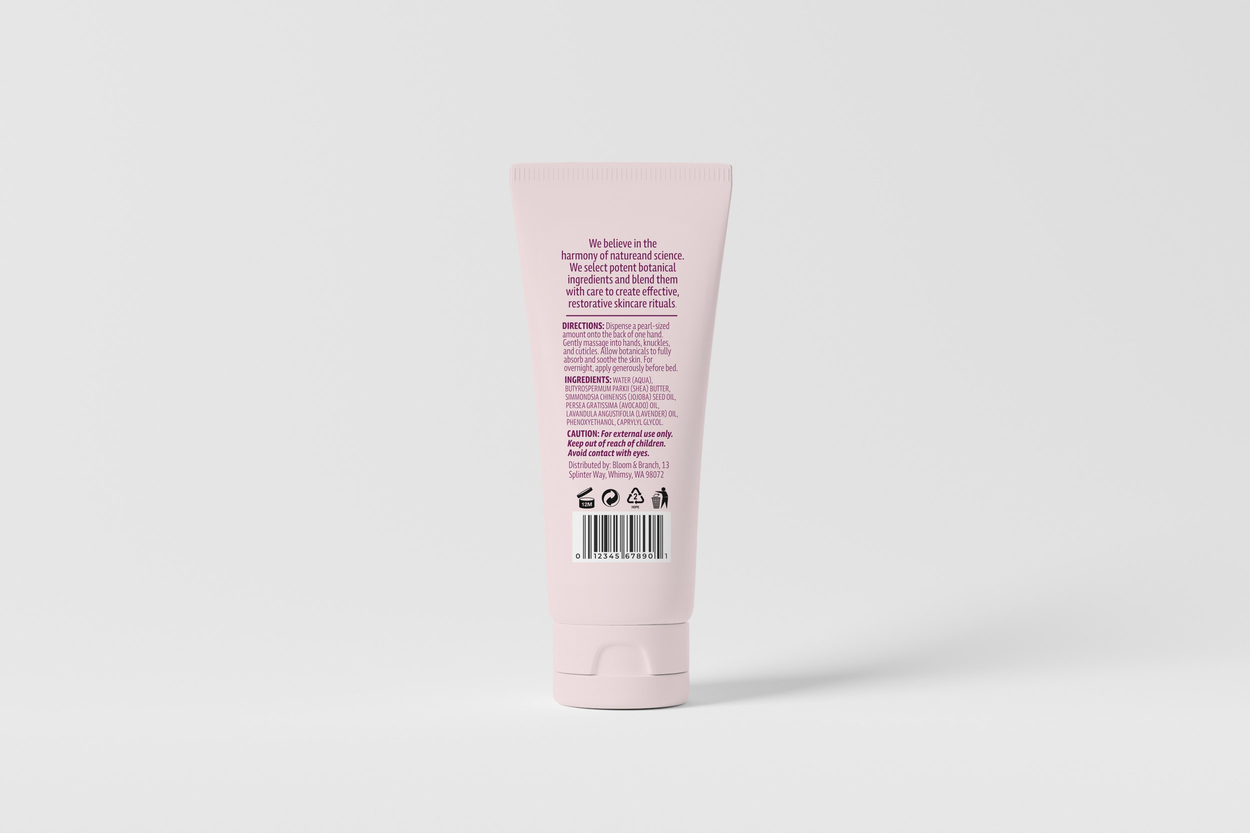
For the premium "Botanical Repair Hand Salve," the approach was minimalist. I designed a custom, tapered dieline that complements the bottle's shape, creating a more elegant silhouette. The use of negative space, delicate typography, and a "soft-touch" matte finish were all intentional choices to convey a sense of luxury and bespoke quality.
Reflection
This project demonstrates a strong understanding of how design directly influences brand strategy and consumer perception. It showcases not only the technical skill of creating custom dielines from scratch but also the ability to use visual language to target different market segments effectively.